
Introduction
Qeexo AutoML provides feedback on trained models through tables and charts. These visualizations can be useful in determining how models trained in Qeexo AutoML should perform in live classification and can help form suggestions for how to improve model performance in specific circumstances, such as diagnosing why a certain class label is hard to classify correctly, or how to deal with an edge-case. In this blog post, we will explore which visualizations are available and how to interpret them.
We will look at two problems and machine learning solutions in this post: the first problem is very difficult to classify, and the results show that the machine learning solution only solves the problem partially. The second problem is easier, the machine learning solution performs better, though it is not perfect, and the results give indications for where and possibly how improvements can be made. Through exposure to both situations, the reader will be able to make better use of Qeexo AutoML to improve their understanding of their data and performance of their libraries.
Visualizations
The various visualizations provided by Qeexo AutoML will be explained here, in the same order as they are presented on the results page. This order was chosen for its practicality: it is the most common order (due to the progression of subtasks) used by machine learning engineers when working on a library.
UMAP
UMAP (Uniform Manifold Approximation and Projection) is a visualization technique documented on arxiv. UMAP provides a down-projection of the feature space into two dimensions to allow for visual inspections, giving information on the separability of instance labels. This is used as an indicator for how well a classifier could perform. Instances are colored based on the event labels, so it can be observed whether distinct labels may be separated based on the available features.

PCA
PCA (Principle Component Analysis) transforms the data into a new orthogonal basis, with the directions ordered by their explanation of the variation in the data. The two-dimensional PCA plots in Qeexo AutoML show the data projected onto the first two PCA directions. Similar to UMAP, these PCA plots give an indication of how separable the data may be when building machine learning models.

Note: Both UMAP and PCA are projections from a higher-dimensional feature space onto two dimensions. Separability of the classes in the two-dimensional plots should imply separability in the higher-dimensional space. However, lack of separability of the classes in the two-dimensional plots does not always imply lack of separability in the higher-dimensional space: the structure of the data in the higher-dimensional space may be such that machine learning models can still separate the data and find good solutions to the problem.
Confusion Matrix
The confusion matrix shows machine learning evaluation results in a grid, giving a breakdown by class of how the evaluation examples have been classified. The rows of this grid correspond to the true label, while the columns correspond to the predicted label. Therefore the diagonal elements represent correct classifications while the off-diagonal elements represent mis-classifications.
The following measures, computed from the confusion matrix, are of use when understanding the ROC curves and F1-score plots in a later section:
- True positive rate (sensitivity, recall): correctly-labeled positive instances divided by the total number of positive instances
- True negative rate (specificity): correctly-labeled negative instances divided by the total number of negative instances
- False positive rate: incorrectly-labeled negative instances (classified as positive) divided by the total number of negative instances
- False negative rate: incorrectly-labeled positive instances (classified as negative) divided by the total number of positive instances
- Precision: correctly-labeled positive instances divided by the total number of instances that have been classified as positive
It is important to keep in mind the trade-offs between these values when choosing how to balance a machine learning model. Depending on the task, it may be more important to have a high true positive rate, such as when it can be costly to miss a defective product, for example when performing quality control for automobile airbags. Increasing the true positive rate will have the trade-off of also increasing the false positive rate (or at least keep it constant) with all models. This can be an issue, for example, with a pacemaker. If it is constantly detecting a cardiac event and shocking the user, it could result in tissue damage or other problems if none had occurred (a false positive). Many of the visualizations in Qeexo AutoML derive from the need to balance these measures.

Cross-Validation: By-fold Accuracies vs. Classes
Qeexo AutoML performs 8-fold cross-validation when a new model is trained. The data is split into eight separate folds, seven of the folds are used to train the model, and the held-out 8th fold is used to evaluate performance. This process is repeated seven more times for each hold-out fold and the results are combined to determine performance. Training and evaluating via cross-validation allows one to get multiple draws from the training data set, so that the results across the folds are less likely to be accidentally biased in some way due to an unlucky split in the data. The values provided by multiple evaluation folds enables one to build up statistics (e.g. standard deviation) to get an estimate of the error of the evaluation result (e.g. mean value). All of the training data is utilized and treated equally; none of it is just used for training or evaluation.
The results of cross-validation are displayed as a bar graph. Bar heights indicate average by-class accuracy over all folds. Individual fold performance is shown as a scatter plot overlaying the bar for the specific label. The by-fold numerical accuracies are also displayed in a chart on the results page underneath the graph. Note that a given OVERALL accuracy number in the graph and table is the prediction accuracy based on all evaluations in the specific fold; it is not the average of the by-class accuracies within the fold.

MCC
The Matthews correlation coefficient (MCC) is a performance measure for two-class classifiers. It takes the correlation between the predicted labels and the true labels after converting them to binary. For Qeexo AutoML we have extended the measure to work with an arbitrary number of classes; this is done by computing an MCC score for each pair of classes based on their confusion sub-matrix.
MCC has an advantage over raw accuracy in situations where the class labels are not well balanced. A good example of this is when Qeexo AutoML is attempting to determine classifier performance in an anomaly detection task where only a few examples of the bad class are available among hundreds or thousands of instances. Using the MCC measure in place of accuracy can give a more well-rounded view of the fitness of the classifier.
Here are some useful pieces of information about MCC:
- Values are in [–1, +1]
- Larger values indicate better classifier performance
- +1 corresponds to a perfect classifier
- 0 is equivalent to a random classifier
- –1 corresponds to an exactly-wrong classifier

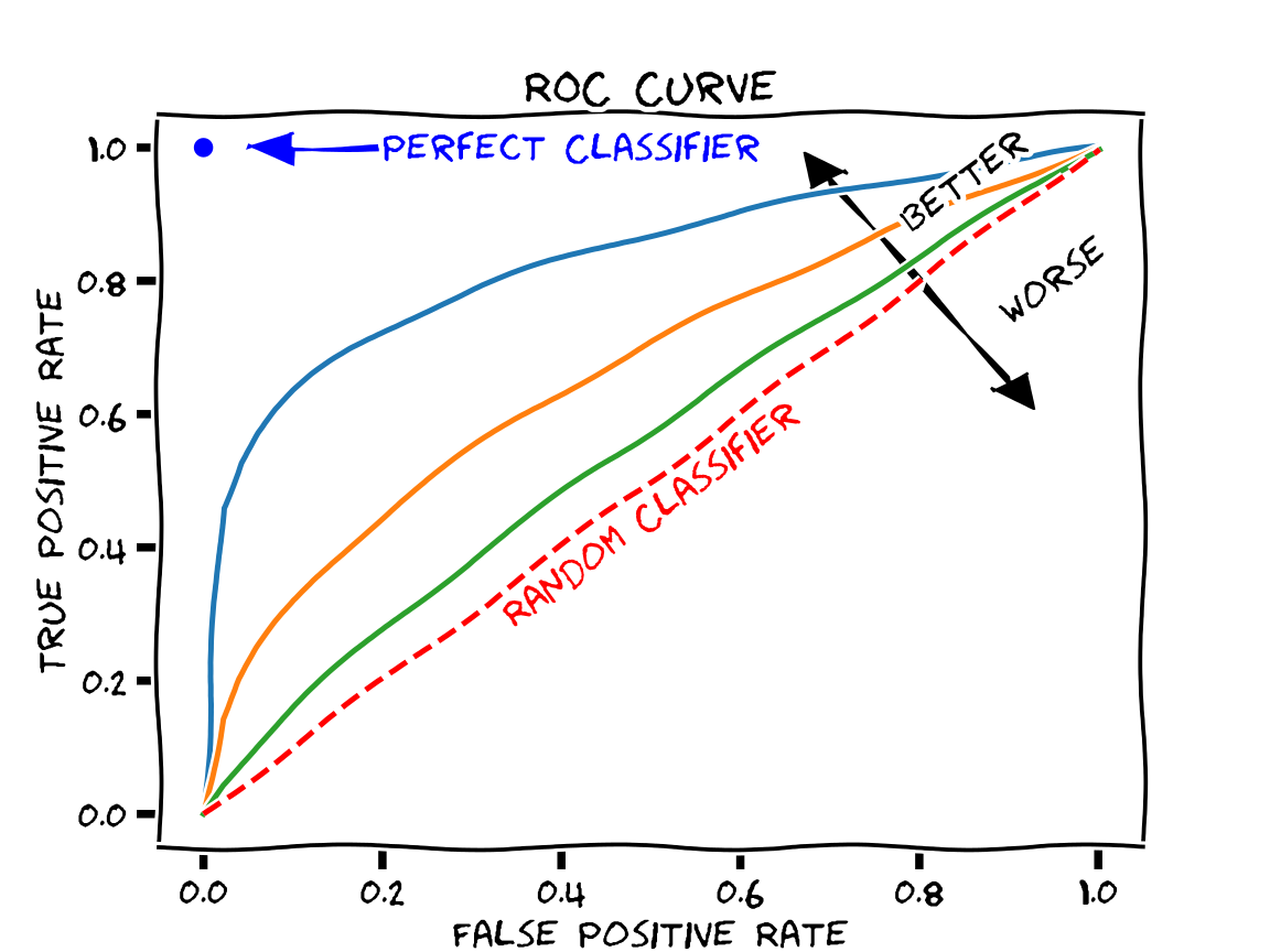
ROC Curve
The ROC (Receiver Operating Characteristic) curve shows how different threshold values (applied to the continuous output of the classifier; e.g. class probability) affects the false positive rate (FPR) and true positive rate (TPR) of the classifier in cross-validation. As different thresholds are selected, the point on the graph with the FPR on the x-axis and TPR on the y-axis is found and plotted as a dot. These dots are then connected by line segments. Qeexo AutoML will generate these curves for each label and overlay them in different colors. This allows the user to determine how trade-offs in performance will have to be made with different thresholds.
The ROC curve can be used to generate summary statistics for describing the fitness of the model. A common one, which we compute with Qeexo AutoML and provide with the ROC curve plot, is the AUC (Area Under Curve). This is the integral of the ROC curve, and it has these properties:
- Values are in [0, 1]
- Larger values indicate better classifier performance
- +1 corresponds to a perfect classifier
- 0.5 is equivalent to a random classifier
- 0 corresponds to an exactly-wrong classifier


F1-score
The F1-score is the harmonic mean of precision and recall, each of which have been defined above.
F_1 = 2 * precision * recall / (precision + recall)
Similar to the MCC, the F1-score is a performance measure, with larger values being better. It is in the range of 0 to 1, so the best value is 1. Similar to the ROC curve, we have chosen to plot the F1-scores against the False Positive Rate as we sweep through the threshold values. In the graph, the dotted vertical lines each indicates where the F1 score is maximized for a class.

Learning curve
The learning curve runs consecutive cross-validations with varying amounts of training data. The shape of the curve, and in particular the slope of the curve near the high limit of available training data, can be used to estimate whether additional training data could improve classifier performance. Given enough training data (drawn from the same underlying distribution), the learning curve will eventually asymptote to the best possible performance.

Discussion
The example plots above were from a Qeexo AutoML pipeline run with real data collected by Qeexo during the development of an embedded solution. In this case, each data set collected had a linked “testing data” for the specific “training data” label. As a result, two plots are generated for each type of analysis. The left (or center for single column figures) plots for each figure consist of training and evaluation of the model with cross-validation. When right-hand plots are shown, they are generated from evaluations on the “test” data (which is only used for evaluation, not for training).
Task Description
The task consisted of recording microphone data from stepper motors which rotate for 3 seconds, reverse direction, rotate for 3 seconds, and repeat. Some of the motors were determined by a factory quality assurance team to be defective for one of several reasons; those motors were labeled BAD, while the non-defective motors were labeled GOOD. The quality assurance team used sound to perform the classifications, but due to the subtlety of the difference in sound between the GOOD and BAD motors, this task is difficult for humans to perform. As we see from the results above, the machine learning model, trained on microphone sensor data, also struggles with this classification task.
Feature Exploration
This particular example had very hard-to-classify data. The UMAP and PCA plots are consistent with this. While there are some BAD examples that are mostly-separated from the GOOD examples (UMAP: x less than about 2; PCA: distance from origin greater than about 0.1), most of the BAD examples are intermingled with the GOOD examples in these projections.
UMAP and PCA plots such as these could be indicative of improperly-collected or mislabeled data, a lack of information in the sensor stream(s) used for separating the classes, or a feature set that is inadequate for extracting the information necessary for separation.
Performance Analysis
The confusion matrix and cross-validation results show that the model has learned at least something about the problem, but the performance estimates are not great (70 ± 10% overall). The model can correctly classify some of the GOOD training motors (80 ± 10%), but is not doing better than a coin-flip on the BAD training motors (50 ± 30%), although the results vary a lot by training fold. The performance of the model on the held-out test data is a bit better, about 90% on GOOD motors and 60% on the BAD ones; this seems to be consistent with the variation seen in the cross-validation results shown in the by-fold accuracies vs. classes plot and table (Figure 4).
While the classes have some degree of imbalance in this problem (82 good motors, 56 bad motors, with an equal amount of data collected from each), this imbalance is not extreme enough for the overall accuracy to be a useless metric, and it has an advantage over the MCC in one respect: we have intuition about accuracy, but most of us do not have intuition about MCC. Looking at the MCC scores (0.27 for the training data, 0.51 for the testing data), they seem in line with prior analysis: the model has learned something (MCC = 0 is equivalent to coin-flip), the model is far from perfect (MCC = 1 is perfect), and the model performance on the test data is better than on the training data.
The ROC and F1-score curves are generally useful for understanding a model’s performance across a wide range of thresholds, and possibly fine-tuning the threshold to balance the model to the desired trade-off between the classes. The model performance curves for the training evaluations are not encouraging in the case at hand: there does not seem to be a threshold that can improve the overall model performance from the default threshold value used to produce the cross-validation results. The test curve, on the other hand, shows a bit more promise. In the test ROC curve, one can see that by choosing a lower threshold, it is possible to get into the upper–70s in terms of accuracy for both classes simultaneously (True Positive Rate ~ 0.78, False Positive Rate ~ 0.22 -> True Negative Rate ~ 0.78). This is a little better than the overall test accuracy value (76%) computable from the confusion matrix. The ROC and F1-score curves are usually more useful when the model is close to the desired performance.
The learning curve gives an estimate for whether adding more training data will likely result in increased performance for the model under consideration. Unfortunately, in the learning curve plot for the problem at hand, while there is a slight increase in performance on the BAD data from 25k to about 45k training examples, over the same range the performance on the GOOD data is constant or decreasing slightly. The curves as a whole appear to be pretty flat, indicating that more training data of the same type is unlikely to significantly improve performance for the model in question.
Note that in general, learning curve results hold for the given model and hyperparameters set under consideration. It could be that the model is just not complex enough to learn the problem (meaning it has high bias error), and that a more-complex model could do better. There could be a benefit from adding more data (that is, the learning curve when considering a more-complex model and hyperparameters set could have positive slope near the end of the graph). It is also possible that the performance just will not increase beyond the upper bound seen in these results regardless of more data.
Overall, the results show that while the model has learned from the data, it has not learned enough to approach Qeexo’s original goal for this problem: to achieve by-class accuracies greater than 90% on this task. The gap is great enough between actual and desired performance that it indicates some basic change will be needed to improve the situation:
- verify that the data sources have been labeled correctly
- use different sensor streams that can capture better separability information
- use different features for the same reason (for feature-based models)
- perform more exploratory data analysis and data visualization to better understand the core problem
Alternative Task
The previous figures were generated with a problem and data that is difficult to classify. We also want to give the audience an example problem and data where a model performs better.
Task Description
This task is described as an “air gesture classification”. It consists of using accelerometer and gyroscope on an embedded device which is affixed to a stick used to perform motion gestures. These gestures include raising and lowering the stick, labeled DRUMS, and rocking the stick back and forth, labeled VIOLIN. The BASELINE label consists of not moving the stick, and is the appropriate output for when the user is not moving the stick in either the DRUMS or VIOLIN gesture.
Task Results
The UMAP visualization for this task shows very good separation between DRUMS and the other classes. There is overlap between VIOLIN and BASELINE, although there appears to be a large area of BASELINE outside of this region of overlap.

The PCA plot gives similar information: DRUMS appears to be quite different from the other two classes in this projection, while VIOLIN and BASELINE appear similar to each other. The fact that DRUMS appears separable seems reasonable: playing drums requires broad sweeping motions that should create large-magnitude swings in the inertial sensors.
These plots indicate that DRUMS should likely be separable from the other two classes. VIOLIN and BASELINE may also be separable by a machine learning model, but there is no good indication of that in these two-dimensional projections.

The confusion matrix shows OK classification. Most of the values are along the diagonal with by-class accuracies of 74% for BASELINE, 97% for DRUMS, and 77% for VIOLIN. The two most commonly-confused classes are BASELINE and VIOLIN, with each being classified as the other about 20% of the time. This result is not surprising given the aforementioned visualizations, but given the nature of the problem, we should expect better: these two gestures are different-enough to be obviously recognized as different by humans performing or observing them, and the differences should be obvious in the sensor streams chosen (accelerometer and gyroscope).
It is surprising that a significant fraction of the BASELINE data (~9%) has been mis-classified as DRUM. These two classes were well-separated in the UMAP and PCA plots, and given the differences in these gestures we might expect these two classes to be the easiest to separate. In addition, the mis-classification is not symmetric: only about ~2% of the DRUM examples are mis-classified as BASELINE.

The by-fold cross-validation results give valuable information that is not captured by the overall confusion matrix: the model performance varies a lot by fold. Half of the folds show good-to-excellent performance with 95% or greater overall accuracy with reasonable by-class accuracies. This indicates that for these folds, training is probably proceeding well, and that the problem in general is likely solvable by the model in question. The other folds show serious problems: each fold has at least one class with by-class accuracy less than 50%. This indicates that there is some problem with the model, although it’s not clear what the problem might be. We’ll discuss in a later section about what might be going wrong.

The MCC results support what we have seen so far in the confusion matrix and cross-validation results: the problem is solved to some extent, but there is likely an issue with the performance with the BASELINE class. The DRUMS-VIOLIN score is quite good (meaning the model separates these classes well), but the scores involving BASELINE are less promising.

The ROC curves from this model are clearly better than those from the previous example problem, with larger AUC values (all > 0.9). These curves, as well as the F1-score curves, also show that the BASELINE class has lower performance than the other gesture classes.


The learning curve for this model shows that as we increase the amount of data, we are improving the BASELINE classification without decreasing performance for DRUMS or VIOLIN. Based on the confusion we see with the current model, combined with the appearance of the curve not approaching an asymptote (probably), it is reasonable to expect that collecting more data and retraining the model would increase the BASELINE separability.

Performance Analysis
Several pieces of information point to poor performance of the BASELINE class, and the by-fold cross-validation results show that there is some sort of problem for half of the training/validation fold pairs. The learning curve result indicates that more data could increase performance of the BASELINE class.
Ideas about possible root causes of the problem seen in the by-fold cross-validation results along with possible actions follow:
- The training data may not be diverse enough. Specifically in this case, the BASELINE data may not be diverse enough. We at Qeexo have observed this difficulty often in problems in which there is a “baseline” or “background” kind of class. If the BASELINE data collections were performed with the stick held very still, or with just a few grips on the stick, large sections of the BASELINE data could be very similar to each other while also being quite different (from the standpoint of say statistical features like mean and variance of the signal) from other large sections of the BASELINE data. For example, each section might be comprised basically of 0-vector data for the gyroscope, and constant-vector data for the accelerometer, but different and distinct constant accelerometer vectors for each section. Another way to look at it is that the BASELINE data might look like several discrete scenarios that do not connect to each other very well in feature space. This situation can cause machine learning models difficulties in training. Note though that the UMAP and PCA plots do not directly support this hypothesis: the BASELINE data appears mostly clumped together in those plots. On the other hand, there are BASELINE outliers in the PCA plot, and the UMAP plot has a relatively-large area for the BASELINE data. With more rich BASELINE data, it is possible that the machine learning models will learn to generalize better to other BASELINE scenarios not in the training data.
- There may not be enough training data. By its nature, cross-validation trains on part of the training data and evaluates on the held-out validation set. If some particular scenario (e.g. the user holds the stick with a certain grip) only appears for a short time in the training data, when the data associated with that scenario is mostly or entirely contained within a validation fold, the training fold will contain little or no data associated with the scenario, and the model may not learn and perform well on that scenario. Collecting more training data of the same kind that has already been collected should help in this case. This is supported by the shape of the learning curves. Also notable: more training data is likely to help for the last two points described in this bullet list: if there is overfitting or lack of convergence.
- There may be a problem with some of the data. If it has not been done already, the data should be visualized to make sure that there are no corrupted parts. Visual inspection of the data should also show human-readable separability for this problem, given the nature of the air gesture use case. If it does not, there is likely something wrong somewhere in the data collection process.
- The machine learning model may sometimes be overfitting to the training data; that is, it may be learning not only the underlying problem that we want to solve, but also the noise that exists in the training data as well. If so, changing the model hyperparameters in a way to make the model less complex or to increase regularization may help reduce the model variability and improve performance.
- Depending on the model type used, the model may have failed to converge for some of the folds. We at Qeexo have observed this most often for some neural network models. This may be considered a sort-of sub-case of the previous point. Changing the hyperparameters may improve performance in this case as well. For example, increasing the number of epochs while also reducing the learning rate may help.
We think the first two points above are most likely the best explanations of the problems seen in the evaluations, and contain the best ideas for fixing the problems: collect more training data, and in particular collect more BASELINE data in a way that gives more diversity for the data for that class.
A variation of this use case after improvements had been recorded into a demo.
Conclusion
Qeexo AutoML not only provides model-building functionality, but also presents visualizations of the data and evaluation metrics for the trained models. By understanding these various visualizations and metrics, one can gain insights into the problem the model is attempting to solve, as well as how the model is performing on the collected data and how it might be expected to perform when deployed to the device. (Deployment to device can be done with just one click on Qeexo AutoML.) Such insights can lead to useful actions that can significantly improve the performance of the machine learning model.