In the sprawling world of industries powered by machines and motors, the quest for effective condition-based monitoring has been relentless. The intricacies of maintaining optimal motor conditions within vast and dynamic environments have long presented a challenge. Enter the transformative solution: Effective Motor Condition-Based Monitoring, developed and scalable from Qeexo AutoML to ensure motor health. This blog delves into the innovation, technology, and impact behind this simple, yet highly effective approach to motor maintenance.
Empowering Industry with Precision
Picture an industrial setting teeming with motors driving the heartbeat of operations. Motor Condition-Based Monitoring is poised to revolutionize this landscape. Without having to take care of individual motor’s health in a large fleet by performing physical inspection, Qeexo AutoML allows us to make those motors self-aware and report anomalies as they occur with the help of the data, we train it on.
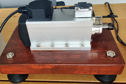
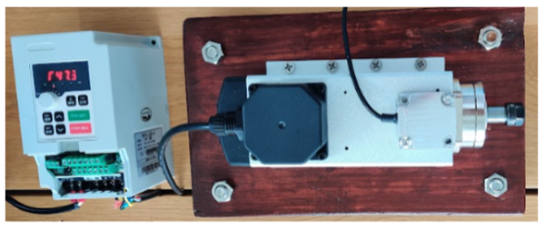
The Motor in Focus: Spindle Motor and H100 Inverter
This demo focuses on the Spindle motor, found in many industries and synonymous with CNC machines. This dynamic frequency motor is controlled by the H100 Inverter. The challenge lies in maintaining optimal conditions autonomously, a task made achievable through machine learning.
A Symphony of Data Collection and Analysis
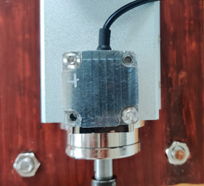
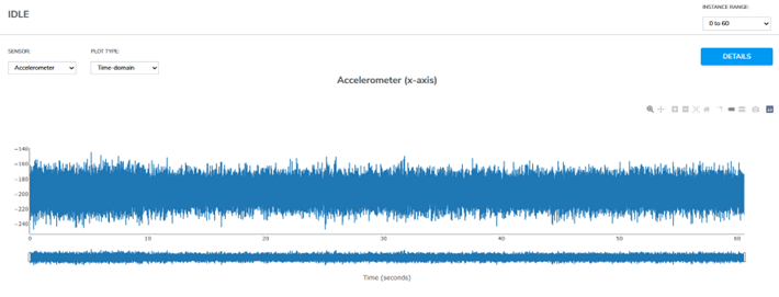
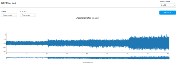
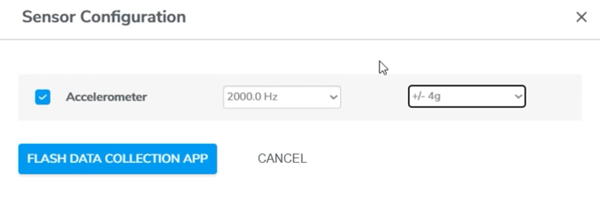
Qeexo AutoML takes care of this very challenge, taking care of every step right from the process of data collection to model training. Vibrational data, a rich source of insights, is harnessed using the Flamenco device by TDK, featuring a high-precision accelerometer. The motor’s behavior unfolds across three states: Idle, Normal, and Fault.
Data Collection Strategy: Crafted for Precision
The motor’s behavior is recorded across varying frequencies—25 Hz, 50 Hz, 75 Hz, and 100 Hz—enabling a comprehensive understanding of its vibrational signature. Each state is sampled, ensuring a robust dataset that mirrors real-world scenarios. According to the Nyquist theorem, the sampling rate (ODR) should be at least twice the highest frequency present in the signal to prevent aliasing and accurately reconstruct the original signal. In my case, the motor exhibits unique features around 1kHz so I set my sampling rate to 2kHz to accurately capture the motor’s frequency.
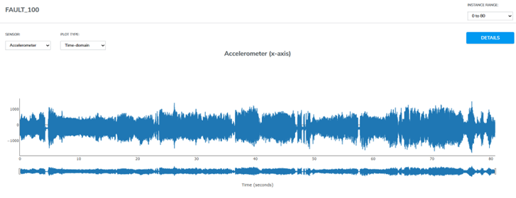
Unveiling the Fault Anomaly
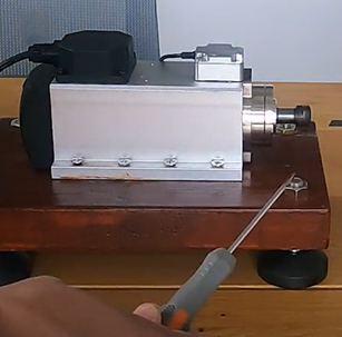
To emulate a fault scenario, a simulated anomaly is introduced—a screwdriver in contact with the rotor. This friction-induced instability triggers erratic vibrations detected by the Flamenco accelerometer. The continuous contact between screwdriver and rotor ensures distinct vibrations in the “Fault” dataset, unmistakably deviating from the “Normal” class.
Model Training: Art Meets Science
The heart of the Motor Condition-Based Monitoring demo is the model itself. With Qeexo AutoML providing multiple models to choose from, Gradient Boosting Machine (GBM) was found to be the highest performing compared to all other models. By assigning weights to minority classes, it accommodates transitions across motor frequencies and negates misclassifications.
Seamless Live-Testing and Unveiling Insights
The results were—a dynamic classifier capable of distinguishing between normal, fault, and idle classes across the motor’s frequency spectrum. Swift, accurate classification changes underscore the model’s effectiveness in discerning motor health shifts in real-time.
Unlocking the Potential: Single Class Anomaly Detection
While training covers Idle, Normal, and Fault classes, there is another approach that can be taken — Anomaly Detection. By grouping Idle and Normal into a single class, the model can be trained to sense any deviation from the norm—a worn belt, loose screw, or external interference— the model flags the anomaly and alerts the technician with real-time fault detection.
Conclusion: The Era of Autonomous Motor Health
As industries continue to adopt DX strategies Motor Condition-Based Monitoring stands at the forefront of this change in thinking. In combining mechanics with sensors, this solution lays the foundation for autonomous motor health upkeep, which can be integrated into any MES, SCADA, PLC, or other manufacturing system to build predictive maintenance solutions using historical and sensor data, transforming industries into a new era where motors are no longer just mechanical entities but dynamic, self-aware systems. Welcome to the future of motor health—empowered, intelligent, and revolutionized.
In this article, we are going to introduce you some of the latest and greatest new features and improvements released in Qeexo AutoML 1.20.0.
Feature 1 – Arm Keil and IAR IDE Integrations
Starting in Qeexo AutoML version 1.20.0 we’ve extended our IDE support to Arm Keil MDK and IAR Workbench IDE projects. Depending on which embedded IDE used, you simply need to download and install our .pack file (Arm Keil MDK) or static library and project connect file (IAR Workbench) to include your machine learning solution into your own custom project. To start integrating your model into your own custom IDE project, check out our helpful project integration guides:
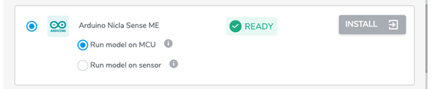
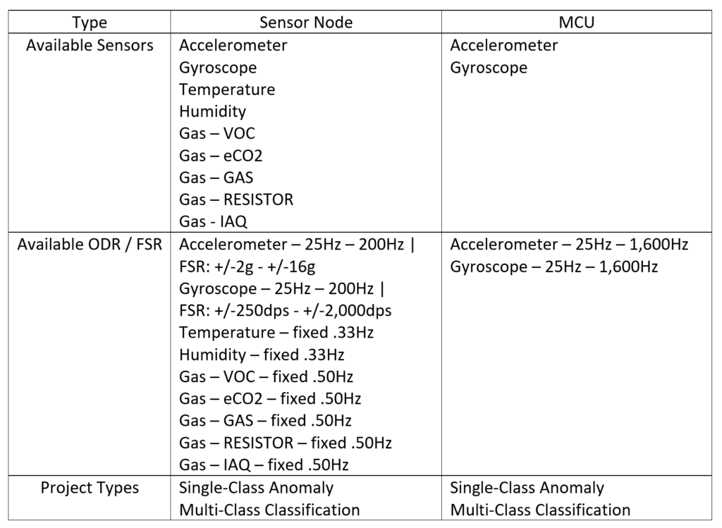
Improving support for Nicla Sense ME, we’ve added a new option enabling you to run your data collection and model either directly from the sensor or from the microprocessor (MCU). Please note that available sensors, ODR, and models may differ between sensor and MCU project types.
Feature 3 – Sync (Offline Mode) Feature
Listening to your feedback we’ve added a brand new Sync feature for our 1.20 release. This feature protects against network instability and dropouts by storing your data locally until network conditions improve. If you ever experience a network interruption or any other issues that cause the uploading process to halt, you can simply click the ‘sync’ option to find all incomplete data collections and resume upload for the project.
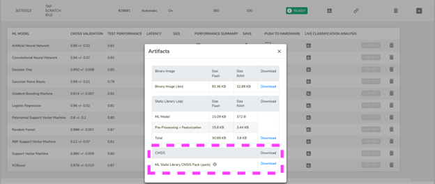
For AVH projects, we now support ML model binary, static library, and CMSIS pack download options so you can export your model and integrate it into your own custom embedded project. To export your trained AVH model, simply navigate to the models page, click on the save icon, and select the output format that best works for you. Please note: due to a known issue, AVH project files will only be available after Live Replay, so if you see N/A for any of the downloadable artifacts, please try performing Live Replay and then returning to the export option to download.
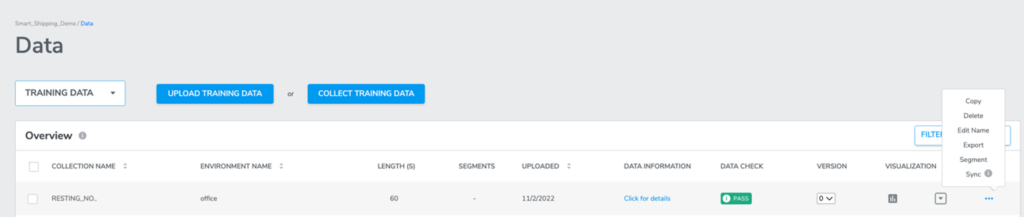
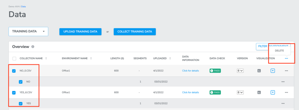
Feature 5 – Bulk Delete Feature
The Bulk delete feature enables you to delete multiple, or even all data collections at once, saving precious time. To use this feature, simply navigate your training data page, select all of the data collections that you would like to delete, and from the headings menu click the “…” option, and then the delete option to confirm the deletion in the pop up window.
To learn more about the great features in this release please check out our release notes.
If you would like more information or a workshop on our Qeexo AutoML product or features, please drop us a message.
In this article, we are going to introduce you some of the latest and greatest features and improvements released in Qeexo AutoML 1.19.0.
Feature 1 – ‘FILTER ENVIRONMENT’ feature, DATA page
Image 1 – Where to find the Filter Environment feature
Image 2 – The Filter pop-up window
‘FILTER ENVIRONMENT’ enables you to filter your data collections with different environments settings and sensor configurations settings.
When the user clicks the ‘FILTER ENVIRONMENT’ button, there will be a pop-up window. On the very top area of the window, there is a drop-down menu for users to select to list either all environments or any specific environment. Moving down, there is a two columns table where users will see environment names and sensor configurations settings. Users can click or unclick the checkbox to the left to select any environment(s), then click FILTER button to apply. Once option has been applied, users will be navigated back to DATA page, and only those data collections that match with the selection will be displayed under the DATA page.
Video 1 – Filter Environment
Feature 2 – ‘SELECT ALL’ feature under DATA page
Image 3 – The new data page SELECT ALL feature
‘SELECT ALL’ button enables users to select all data collections listed under DATA page with a single click. This feature is very helpful when users have many data collections to select to train a model. It saves users a lot of time and work. If users have data collections that are sharing different environments or different sensor configurations, users could use ‘FILTER ENVIRONMENT’ button to filter data collections, only keep those that need to be used. Then use the ‘SELECT ALL’ checkbox.
Please note that although users are allowed to click to select all data collections regardless of sensor configuration settings, the START NEW TRAINING button will only become clickable when all selected data collections share the same sensor configuration. If there’s multiple pages of data collections, users will need to SELECT ALL for each page.
Video 2 – Select All
Feature 3 – Upgraded ‘Data Segmentation’ feature under DATA page
Image 4 – The Create New Segment pop-up window
The upgraded Data Segmentation features save users time and work on cropping a data collection into many different segments.
User can click on ‘CREATE NEW SEGMENT’ button to create a segment label, then select a color. After users click the ‘CREATE’ button, users will be able to click the start and end point of a segment on the data plot as many times as needed. If there’s another segment label users would like to create, users could simply repeat the process to crop data with a new segment label.
Image 5 – Data SegmentationVideo 3 – Create new segment
Every time a user creates a segment, the segment will automatically be displayed in the segments list under the data plot. Users have the option to edit (including name, duration (start and end time)) or delete it.
To help users match the segments on the plot with the lines under plot, we have added a click and reveal feature to indicate the corresponding segments from the plot when the user clicks the segment’s checkbox.
Image 7 – Selecting a segment automatically highlights it in the graphVideo 5 – Click and reveal segment
Additionally, by clicking the check box to the left of the segment label(s) on the top, it will select all segments. Users could also click the trash button on top right to delete all selected segments at once.
Image 8 – Select allVideo 6 – Select and delete all segments
Feature 4 – ASSISTED SEGMENTATION feature under DATA page
Image 9 – Assisted Segmentation
Image 10 – The Assisted Segmentation pop-up window
Assisted Segmentation provides users with an even quicker way to crop a data collection into segments. Users just need to manually crop a few segments for each label and then use Assisted Segmentation to help detect those data points that share the same information. More specifically, users could follow the steps in Feature 3 – click ‘CREATE NEW SEGMENT’, create a segment label, click the start and end point on data plot to crop a segment. Then users could simply click ‘ASSISTED SEGMENTATION’ button on the top right. There will be a pop-up window for users to select segment label(s) for assisted segmentation. Once users clicks NEXT, Qeexo AutoML will detect the segments for the un-cropped areas and list them on both the data plot and segments list below. Users could either ACCEPT or REJECT the result depending on how satisfied you are with the segmentation.
Image 11 – Assisted Segmentation results
Feature 5 – Advanced option of setting up ML Static Library Memory Constraint
When Pro Tier users select data collections and continue to click START NEW TRAINING button to start the model training, we added a new advanced option to allow users to configure ML Static Library Memory Constraint, more specifically, users could set the target ML Static Library maximum flash and RAM memory size usage as desired. Generally, the model performance will reduce as the model size reduces, but not by a lot. The tradeoff should be worth it.
In the ‘Algorithm Selection’ window, user could click CONFIGURE button to access to the Memory Constraint feature. The toggle on the right side should be enabled before users type in any values in the field on the left side.
Image 12 – Advanced options step 1 – ConfigureImage 13 – Advanced options step 2 – Enable with the slider on the right, then enter settings
Feature 6 – Report on size taken by ML Model and Other code separately per ML library built under Model page
Image 14 – Model size reporting
After users trained a model, under performance summary for each ML library (algorithm) built, we added a new feature to report the size occupied by ML model. From here, users could check the flash and RAM size of binary image, ML model, pre-processing + featurization and the total size. The very basic benefit is that it brings more model information for users to use as a reference when selecting the final model. We are sure it also provides more flexibility and possibilities per user case.
Feature 7 – DATA Augmentation Toolkit
Data augmentation is a new feature that we just added for Qeexo AutoML 1.19.0. The major function is to add more data to the training data which could help the model become more robust. This additional data is basically a fictious data which has been created by applying some operations to the original data. We currently support two types of augmentation – scaling and jittering. These two augmentations are enabled for all sensors except environmental sensors.
Cora Zhang, Michael Gamble, Elias Fallon06 September 2022
This document is intended to help you learn more about fundamental machine learning concepts and how to best apply them to Qeexo AutoML projects in order to achieve the best result.
What is Machine Learning?
Machine Learning is an AI (artificial intelligence) technique that teaches computers to learn from experience. Machine Learning algorithms use computational methods to “learn” information directly from historical data without relying on a predetermined equation. It uses historical data as input to predict new output values. Similar to how humans learn and improve upon past experiences, the machine learning algorithms adaptively improve their performance as the number of samples available for learning increases.
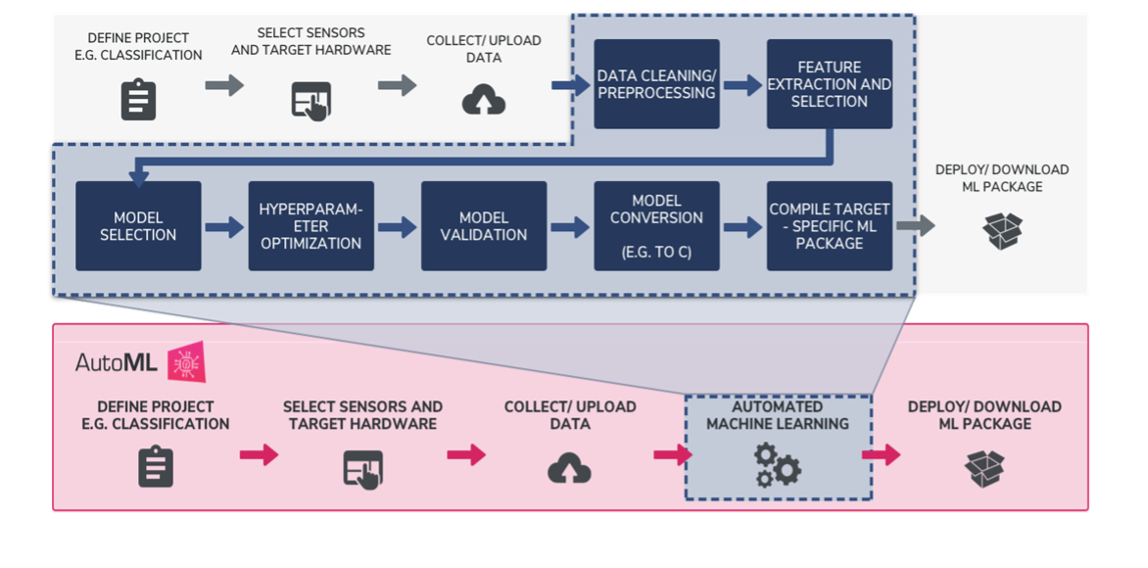
Traditional Machine Learning Workflow VS. Qeexo AutoML’s Fully Automated Machine Learning Workflow
There are multiple stages in developing a machine learning model for use in a software application. The typical phases include data collection > data pre-processing > model training and refinement > evaluation > deployment to production. When starting on a new machine learning problem, you first need to define the project, determining what you want the machine learning model to predict, once defined you can start working on solving the problem.
Qeexo’s AutoML’s fully automated machine learning workflows allow teams to be more efficient in finding the best performing model for their machine learning problem. Automating the most process intensive tasks from traditional machine learning processes, like data cleansing, sensor and feature selection, model selection, hyperparameter optimization, model validation, conversion, and deployment, Qeexo AutoML saves users time, and alleviates a number of challenges, by evaluating hundreds of options and determining which are best suited to learn from your data, all behind the scenes. This is so-called AutoML.
Best Practices for Efficient Workflows in Qeexo AutoML
Define your project / What do you want to predict?
Depending on your machine learning question, you project can be created with one of three different Classification Types: single-class anomaly classification, multi-class classification, and multi-class anomaly classification. Single-class anomaly classification applies when you intend to predict whether new, incoming data is normal or an outlier/anomaly. For example, predicting / monitoring whether a manufacturing machine is working normally or not. Multi-class classification applies when you intend to predict two or more discrete classes of events, for example, whether a robot arm is gripping a box, a bottle, or a bag. Multi-class anomaly classification can be thought of as a combination of the previous two classification types, where other than the learned classes, you also want to be able to predict any event or anomaly that doesn’t fall into the given classes.
Data collection
Data collection is a foundation of a machine learning project. During the data collection, the data quality can be defined as its volume, variety, and veracity. Ensuring your machine learning model has enough data to learn from, the data covers as much scenarios as possible, and data collected are accurate are critical for the performance of the model.
When you are collecting data in Qeexo AutoML, you will need to set up an environment by selecting sensors and corresponded Output Data Rate (ODR) and Full-Scale Range (FSR). ODR also known as sampling rate, is the rate at which the sensor obtains new measurements. ODR is measured in number of samples per second (Hz). Higher ODR configurations, typically specified in KHz, result in more samples obtained per-second. Higher ODRs can improve model accuracy since it provides more information during training and inference, however, for embedded applications, there may be memory, latency, and power consumption constraints that should be considered when specifying your sensor’s ODR. Users may want to test out different ODRs to figure out what will be the best option. Two sensors, which often have variable FSR settings, are accelerometers and gyroscopes. An Accelerometers’ FSR measures acceleration (rate of change of velocity of an object) in X, Y and Z directions, in the units of gravity (g). Gyroscopes’ FSR measures angular velocity in Degrees Per-Second (dps) in X, Y and Z rotational directions.
For a more detailed description of ODR and FSR, check out this post from the Qeexo Blog: ODR and FSR of Sensors
Data Segmentation
The Data Segmentation feature in Qeexo AutoML supports you in editing your data collections to your liking. If your data is event based, or a single data collection you recorded covers multiple different events and classes, it is helpful to use this feature to crop and label your data into individual, discrete events before training. Keep in mind the model will only learn from data that has been labelled and included in training, therefore cropping and labelling individual events helps the model better understand each class and filter outliers and noise which generally leads to improved model performance.
Model training settings
After selecting your data collections you will Start New Training, in Qeexo AutoML this means configuring your Sensor and Feature Selection, Inference Settings, and Algorithm Selection.
Deciding which sensors to use as input to your machine learning model is one of the most critical decisions you can make in solving a problem using sensors and tinyML. For example, if you are trying to recognize a type of motion – such as walk vs. run vs. rest – environmental sensors like temperature, humidity and pressure are probably not going to provide you with all of the data needed to distinguish between the three activities; however, sensors like accelerometer and gyroscope are specifically designed to help you recognize various types of motion, and are often the cornerstone of fitness tracking wearables like as FitBit. Inversely, trying to build an air quality monitor to detect harmful gasses in a factory using only accelerometers and gyroscopes would also likely not lead to optimal results, where environmental sensors such as gas, temperature, pressure, and humidity may provide sufficient information by which to make decisions about a factory’s air safety.
For Sensor and Feature Selection from Qeexo AutoML, there are two two options: automatic or manual. If you know which sensors matter to your ML question, then you may want to go with a manual configuration. However, if you are not sure, selecting the Automatic Sensor Selection option lets Qeexo AutoML test different groups of sensor selections and selects the best combination for you. We advise you to enable as many sensors as possible during the data collection stage and allow Qeexo AutoML to evaluate them for you.
For Inference Settings, there are two figures here – Instance Length and Classification Interval. Instance length is the duration of the incoming data that the software will use to make the prediction. Classification interval is the frequency at which the software will make each prediction. A longer Instance Length corresponds to a larger number of samples for featurization. More data points could yield finer frequency resolution, which captures an increased quantity of information from the signals. Therefore, it produces a greater number of features for the ML model training. Classification interval refers to the time interval in milliseconds between any two classifications. Classification interval is not optimized even when selecting the “Determine Automatically” option. Shorter intervals make predictions more frequent, but consume more power, while longer intervals save power, but can miss quick-burst live-streaming events when they occur between two consecutive classifications. When you have an event that happens in very short time duration, you may want to manually set your Classification Interval to a value smaller than your event duration.
Just like Sensor and Feature Selection, from Qeexo AutoML you can either choose Manual or Automatic Inference Settings. Similarly, choosing the automatic option means Qeexo AutoML will test different Inference Settings behind the scenes and choose the combination that yields the best performance. If you don’t have a solid figure in mind, it is suggested to try with the automatic option and twist it later to improve.
Qeexo AutoML supports up to 17 algorithms from the platform. If you don’t have a specific algorithm that you want to use, we advise you to enable all of them during training, and do a comparison. Once you click Next, the software will start running.
Once training has completed, users have access to a model Performance Summary for each model from Model page. Here you will find a number of metrics useful in evaluating model performance including UMAP Plot, PCA plot, Confusion Matrix, Cross Validation, Learning Curve, ROC Curve, Matthews Correlation Coefficient, and F1 Score.
We are providing some explanation and tips below to help you better use some of these metrics to understand your model performance and where it can be improved.
Confusion Matrix forms the basis for many other metrics including ROC curve and F1 score, so it is critical to understand it first. The two images below may help you better understand what each value in the matrix means. The x-axis are the actual values of your data, whereas the y-axis are the values that your model predicted to be. As you can see from the image on the left, the top left or bottom right cells (in green color), when both actual value and predicted value match, it will show as True Negative or True Positive. Thus, the diagonal elements, starting at the top left, represent the correct classification, meaning you would like to see higher values in these cells. In contrast, the off-diagonal elements (in red color) represent misclassifications, meaning you would like to see smaller values here. If you are seeing a number of misclassifications you may want to try different actions to improve your model performance.
ROC Curve of a classifier is equal to the probability that the classifier will rank a randomly chosen positive example higher than a randomly chosen negative example. The greater the value (area under the curve), the better is the performance of the model.
A high F1 Score is useful where both high recall and precision are important. It tells you how precise your classifier is (how many instances it classifies correctly) and how robust it is (does it miss a significant number of instances). High precision but low recall may give you accurate results for obvious classes, but tends to miss many instances that are a bit more difficult to classify.
To understand F1 Score, user first need to know about precision and recall. Please refer confusion matrix for the meaning of TP (True Positive), TN(True Negative), FP(False Positive), FN(False Negative).
Precision = TP/(TP+FP). High precision focuses on a lower FP. Precision is about how many selected items are relevant. Recall = TP/(TP+FN). High recall focus on a lower FN. Recall is about how many relevant items are selected.
Matthews Correlation Coefficient: Is a measure of discriminative power for binary classifiers. In the multi-class classification case, it quantifies which combinations of classes are the least distinguished by the model. The values can range between -1 and 1, although most often in Qeexo AutoML the values will be between 0 and 1. A value of 0 means that the model is not able to distinguish between the given pair of classes at all, and a value of 1 means that the model can perfectly make this distinction.
For more detailed information about model metrics, please check out the link below:
You have two ways to test your model performance from Qeexo AutoML. The first is to use the Test Data Evaluation feature with test data that has been upload or collected previously. Click the edit test data option > select the test data collection > and click SAVE to execute the test data evaluation. Once the build is complete, check your cross-validation accuracy and model performance summary as a gauge in how well your model would perform in the real-world given the data.
Another way to test your model’s performance is through Live Test. From Qeexo AutoML you can flash the machine learning model directly to your supported embedded device and perform real-time, on device classification to see how well you model performs. This has some advantages in that you may be able to find issues that are not easy to notice through the model performance summary, for example, misclassifications, flickering, classification delays / latency.
Here are some tips when you are seeing misclassifications, flickering, or delays during your Live Test. (1) If you did not collect data from all possible scenario, then you may see misclassifications / flickering when you conduct a Live Test, this is because your model has never learned about the new scenario’s data it just captured through live classification, but it has to pick a class from what it learned in the historical data and assign to it, then it may be a wrong representation. (2) If your data is not balanced, meaning some classes have much more data compared to other classes, then you may see a higher occurrence of the class that counts as the majority. (3) Cross validation is a good measure but Live Test may show a different result. We encourage you to live test on multiple models to find the best performing one for further improvement.
Actions You Can Take to Improve Model Performance
Data collections used for model training
If you are seeing misclassification and flickering in live classification, we advise you to go back to the data you used for model training and verify if your data classes are approximately balanced in proportion, if you have used sufficient data, and if you covered as many scenarios as possible.
If you are using accelerometer and gyroscope and your model yields low accuracy, we advise you to try collect a new data with a higher ODR, as this could result in more samples per second, thus a higher performing model. The smaller the FSR, the more sensitive the accelerometer / gyroscope will be to lower amplitude signals / angular motions. If you want the model to be more sensitive to more detailed movement, lower your FSR.
Twist model inference settings
If your initial model is not performing well and you notice that your data is quick-burst event type, we advise you to try to lower your classification interval as a high value may miss the event. If your event takes some time to finish, check your inference length and try to make sure the length is long enough to cover the whole occurrence of an entire event. For example, when a event is a process of griper gripping an object which takes about 2 seconds. You would want to set your inference length at least 2000ms to capture the entire movement.
Live classification analysis – re-compile library with selected weight
Sensitivity Analysis reflects on how sensitive the model is for classes under consideration. The primary objective of the sensitivity analysis is to make the ML model lean more towards certain class(es) than the other(s). Qeexo AutoML performs the sensitivity analysis using Class Weight. From the models page you can go to Live Classification Analysis to analyze the sensitivity of each class and update their influence on the model performance. Here you can edit class weights and ‘re-compile library with selected weight’. Once you update the selected weights, you can click SELECT on the page and PUSH TO HARDWARE for live classification with new class weights.
The bigger the weight is, the more sensitive the model is to that class. In other words, the model is more likely to output class with the higher weight. Even though you can assign a weight to each class, only the relative difference between the class weights matter. That is, for three-class classification, weights {1,1,1} will have the same effect as {3, 3, 3} because this simply means each class has equal weights.
For real-world applications, finding the right weights for each class is a matter of trial-and-error or some predefined human knowledge. Qeexo AutoML offers very efficient method to test with different class weights, quickly check the classification performance, and then push the newly determined class weights in order to perform the Live Test.
The Single Class anomaly models just output a “score” between 0 and 1 for how likely it is that the new data point is an “anomaly.” The “threshold” where the model decides to classify as “anomaly” defaults to 0.5, but the user can tweak it through Manual Calibration to be 0.7 or 0.3, based on what they are seeing from Live Classification.
In industrial environments, different machine operation behaviors can be detected using machine learning models in conjunction with various sensors – for example, the operational condition of a machine may be monitored using an IMU sensor, and the machine’s vibration signature, responding when the machine deviates from normal operation, or when a specific fault condition is encountered. Similarly, a machine’s operational condition may be detected using its motor’s current signature.
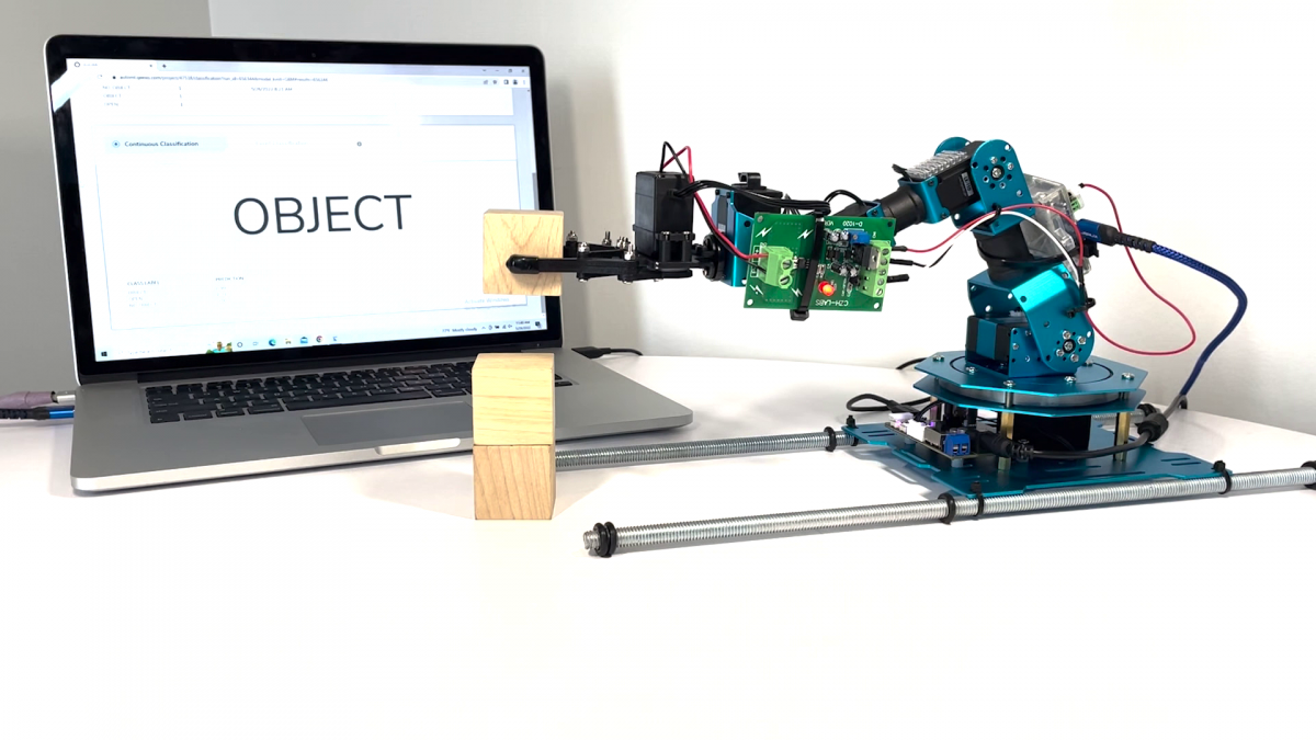
Assuming we are operating a smart warehouse optimized for an e-commerce company. In the warehouse, we employ several, “intelligent robots mover” to help us to move objects from spot to spot. In this demonstration, we have used a miniaturized, “intelligent robots mover” powered by Qeexo AutoML to determine whether the robot griped an object.
This blog is intended to show you how to use Qeexo AutoML to build your own, “intelligent robots mover” from end to end, including data collection, data segmentation, model training and evaluation, and live testing.
Remove the cover from the gripper motor by unscrewing the four screws securing it to the body of the motor.
Put back the screws after removing the cover. This ensures that the motors’ gears do not get misaligned
Connecting the current sensor to gripper motor
When you remove the motor cover, you will see a red color wire within the purple squared area, which looks similar to the wire in the blue squared area on the image below. De-solder the red color wire you find in purple squared area.
Cut a piece of red wire from previously purchased wires. Connect one side of wire to ‘IP+’ terminal on the current sensor module (shown as circle 1 in the image below), then solder the other side of the red wire to the motor (shown as circle 2 in the image below).
Cut a piece of black wire from previously purchased wires. Connect one side of wire to ‘IP-’ terminal on the current sensor module (shown as circle 1 in the image below), then solder the other side of the black wire to the PCB next to the motor (shown as circle 2 in the image below).
While other combination of connections are possible, its best if we stick to a common convention across our demo setups to ensure consistency in the data we collected.
Connecting current sensor to STWIN
Connect current sensor with the STWIN sensor
Connect STWIN with laptop device
Make sure STWIN has been previously installed and set up on your laptop device. If not, refer this link.
Data Collection
Create a project with STWIN (MCU) with multi-class classification
Collecting data
Click ‘Collect training data’ on ‘data’ page.
Step 1 – Create new environment
We assigned ‘office’ as the name of the new environment as data is collected from our office.
Step 2 – Sensor configuration
Make sure to build an environment containing ONLY the current sensor with value of 1850 Hz.
Step 3 – Collect 2 datasets
What data to collect?
We are building a multi-class with 3 classes including ‘open’, ‘object’ and ‘no_object’. This model is meant to detect the gesture of the gripper and whether there is an object gripper gripped.
There are 2 datasets we collected:
Collection label: OBJECT Duration: 600 seconds We collected 600 seconds data of the gripper repeatedly grip a wood block and release it
Collection label: NO_OBJ Duration: 600 seconds We collected 600 second data of the gripper repeatedly grip and release without an object.
Below is a screenshot of what each of the datasets look like:
Data Segmentation
Before we segment the data, it is necessary that we understand the data. Below is a zoom in of the two datasets annotated with their respective classes, this is how we intend to segment our data:
OBJECT For dataset “OBJECT”, we segment the data into 2 classes and labeled them as “OPEN” (blue color areas) and “OBJECT“ (yellow color areas).
NO_OBJ For dataset “NO_OBJ”, we segment the data into 2 classes and labeled them as “OPEN” (blue color areas) and “NO_OBJECT” (red color areas).
Building Model
We are selecting the 2 datasets we mentioned above with their segmentation.
We selected “Automatic Sensor and Feature Group Selection”. By selecting Automatic Selection, Qeexo AutoML will evaluate different combinations of features and choose the best performing feature group for you.
For “Inference Settings”, we Enter Manually and set the “INSTANCE LENGTH” value as 2,000ms and “CLASSIFICATION INTERVAL” as 200ms. A Classification Interval of 200ms means that the software will make a prediction once every 200ms. Where an Instance Length of 2,000ms means the software will use 2,000ms of incoming data to make the prediction. We set Instance Length to 2,000 ms because the gripper takes about 2 seconds to finish each movement (for example opening and closing). By making the Instance Length big enough, we are making sure it covers the whole movement in a classification.
Lastly, we selected two algorithms to train which are “Gradient Boosting Machine (GBM)” and “Random Forest (RF)”. Note that we have previously selected all available algorithms on the platform, and these two are the best in terms of the time taken to train a model, sizes and latency.
Model Performance & Live Classification
Model Performance
Below is a summary of our chosen models’ performance. We flashed GBM to hardware for live classification.
Live Classification
Push GBM to hardware by clicking the arrow button under “PUSH TO HARDWARE” to flash the model to STWin.
From the image under ‘Model Performance’ section, we can see that with AutoML’s sensor and feature selection enabled, we landed with two good performing, high accuracy machine learning models.
Finally, we will flash the compiled binary back to the sensor (aka, the STWIN) and use AutoML’s live classification feature to check if the classifier is producing the expected output. As shown in the video, the final model is performing very well and can accurately recognize whether the robot has an object in within gripper.
It is not recent that AI has begun to find a significant place in our industry and influence it. However, it is undeniable that the development of underlying hardware technologies such as GPUs and CPUs has accelerated the growth of AI and the speed of its introduction into the current industry. With the help of this hardware development, advanced technologies such as voice and facial recognition in smartphones and autonomous driving technology of automobiles are commonplace. It has become an era of entrusting complex tasks, typically performed by a human, to artificial intelligence. AI has become an inseparable factor in our lives, and it is growing in a direction that includes AI in all industries.
The role of the sensor
If AI is analogous to the human brain, then what provides the data to the ‘brain’ so that the AI can develop through accumulated experiences? Sensors. Drawing on our comparison, sensors can be thought of as the sense organs of artificial intelligence; just as in the human body, without these sensory organs, the brain or AI gains no experience from which to learn. As mentioned earlier, various underlying technologies have been developed, and sensors have also developed at a rapid pace. Take for instance common mobile devices that we use countless times a day, which can be thought of as nothing more than a collection of sensors – cameras, GPS, microphone, accelerometer, gyroscope, compass, pressure, proximity, light sensor, etc. Various sensors become your eyes and ears, while the data required by the operating system and applications is constantly being provided by the outside world. The number and type of these sensors continue to increase, and at the same time their size, power consumption, and price are all decreasing. For this reason, it is easy to understand that even inexpensive portable devices are equipped with various sensors.
To acquire and process this diversified and increasing amount of sensor data, the frequency of involvement of the application processor such as CPU or MCU inevitably increases. Therefore, recent sensor technologies are trying to reduce power consumption and become smarter so that the sensor can take charge of functions that are typically driven by the application processor. As part of this effort, sensor makers have gained a competitive advantage by embedding mechanisms capable of performing simple conditional functions in the sensor themselves. The benefit of these internal functions is that the power consumed by the application processor to acquire and judge all of this incoming data can be significantly reduced.
Importance of MLC
Recently, driven by the need for reduced power always-on AI, sensor vendors such as STMicroelectronics have developed a Machine Learning Core (MLC) to embed the model without the application processor operation. Due to this, it is possible to operate the machine learning model directly inside the sensor, maximizing battery life. This is an innovative work that breaks the stereotype that machine learning requires at least MCU-level computing power.
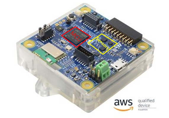
From here, we will look at the advantages of using the machine learning core (MLC) of the sensor compared to running the machine learning model on the application processor. In this example, we will consider STWIN SensorTile wireless industrial node (STEVAL-STWINKT1) – herein known as STWIN – a 120MHz Coretex-M4 MCU with FPU and ISM330DHCX with MLC (Machine Learning Core).
The benefits of performing inside the sensor of the ML model can be summarized as follows:
1. The sleep state can be maximized by minimizing the workload of the MCU (or AP), and battery usage can be maximized by switching the MCU into low-power mode.
As can be seen in the figure above, when the MCU needs to process the ML model, it switches the ‘mode’ of the MCU in response to the interrupts generated by the sensor, it then reads the sensor data and stores it in RAM to execute the ML model functions. As such, the MCU has very little time to maintain the sleep state of the core, and it is not easy to switch the power mode to low-power. However, when using the Machine Learning Core (MLC), the MCU can stay in the Sleep state most of the time unless an event (output result of the ML model) occurs in the sensor, so it spends most of the time at the minimum current provided by the MCU.
Here is an example of STM32L4R9 installed in STWIN. If you check the datasheet of the MCU, you can see the current consumption table as below. Here, assuming a maximum 120MHz operation clock in consideration of the ML model and the load of MCU, minimum current consumption of 18.5mA must be guaranteed for the MCU to run a basic model. However, in the case of using MLC, MCU can minimize the current consumption of the core by switching to Low Power Mode, so assuming that a 2MHz clock is used, current consumption of at least 490uA is required. Therefore, in the case of using MLC, a current consumption gain of approximately 38 times can be obtained through simple calculation.
2. Next, efficiency is high in terms of data traffic. Most inertial sensors have a 3-axis sensor output to express 3D space, and there are many cases where a 16-bit ADC is used. Therefore, even if one sensor packet is read, 6 bytes of data traffic is generated. The amount of data increases exponentially according to the type of sensor and ODR. For example, if you calculate the amount of data to be read by a gyroscope and accelerometer with 104Hz ODR in units of 1 second, you can see that ( 6 + 6 ) x 104 = 1248bytes of traffic per second is required.
However, in the case of MLC, if it is assumed that the number of classes of the ML model is less than 256, the classification result can be checked immediately by reading one byte of the MLC0_SRC.
If it is assumed that one MLC event per second occurs, this can be said to have 1248 times the efficiency.
3. As a result, if the frequency of use of MCU is lowered, ML processing products can be composed only with sensor standalone circuit design, and thus a cost savings effect can also be achieved. It is a well-known fact that the price of an MCU is several times higher than that of a sensor, from the product designers’ perspective, unit price competitiveness is a critical issue related to survival in the market and is a major concern for all manufacturers. Therefore, it can be said that a sensor with MLC has great price competitiveness, manufacturers should think about how to make the most of the MLC function.
Competitiveness of AutoML
As mentioned earlier, the need for machine learning in edge devices continues to increase, and low-power cores and sensors are also embedding Machine Learning Core to secure market competitiveness. When considering the reason why these MLC products are not so widely used in the market even though they are becoming more common, we find it is because using embedded ML or MLC core is somewhat complicated and requires specialized knowledge.
For example, to build a model, data must be collected. To judge the validity of the collected data, it will need to be visualized through various tools, the valid and non-valid parts will then need to be cropped and labeled to create a meaningful dataset for learning – this process is repeated until sufficient data is obtained.
A machine learning model is then built with this data, and the model is estimated through several metrics such as cross-validation. This process requires expert knowledge in parameter settings. Following, the model created in this way must be converted into an MLC model, and the converted model must then be written into the sensor and driven. It is then necessary to verify whether the model performs well or not, and if the model does not achieve the expected performance, additional iterations must be performed to find the optimal model. This process is the most difficult part of the machine learning life cycle, and it contains complex tasks that are difficult to perform alone as an ML engineer.
Is there a way to make these complex processes easier and more intuitive, which can even verify the built model in a short time?
Enter Qeexo AutoML, a brilliantly simple, fully automated end-to-end machine learning platform capable of leveraging sensor data to rapidly create, deploy, and verify machine learning solutions for edge devices running on MCU or MLC. Built for scalability, Qeexo AutoML’s no-code system allows anyone with a machine learning application idea to collect and edit data, train models, and deploy solutions to hardware for live testing, all from the highly intuitive web interface.
Currently, Qeexo AutoML supports two different reference devices that provide MLC capabilities – SensorTile.box and STWINKT1B – these boards are equipped with LSM6DSOX and ISM330DHCX sensors supporting MLC.
This SaaS environment is an advantage and only comes from Qeexo AutoML, using the simple user interface and well-designed platform to train, test, and deploy models for MCU and MLC, it is easier and faster to implement ideas that may have otherwise been deprioritized due to the difficulty of implementing ML devices, maximizing your time, effort, and even financial effect until you test and commercialize your solution.
In conclusion, the driving of ML models of embedded devices is increasingly taken for granted. And the sensors are also embedding the ML core. In this technological flow where ML driving methods are diversifying, Qeexo suggests an easier way. And, for users who have not been able to challenge the use of the sensor’s MLC core due to the difficulty of entry, we present a very simple method to verify the model you made with your own hands on the actual MLC sensor in just a few minutes. In addition, various advantages of using MLC were explained in this article. Therefore, it is recommended to build your own model by building MLC through Qeexo AutoML and try it yourself.
To discover what you can achieve with Qeexo AutoML and MLC register at Qeexo.com.
For any questions, comments, or help getting started with Qeexo AutoML don’t hesitate to reach out and contact us here.
Mike Sobczak, Sr Software Engineer16 February 2022
A demo Qeexo has shown at various trade shows that always gets a great response is what we call our Smart Shipping demo that uses a classifier trained in Qeexo AutoML running on a STMicro STWINKT1B device that is able to detect and display what is being done to the box in real time (whether it is falling, stable, being shaken, etc.). A video of the demo can be watched on YouTube here.
This post will explain how the demo is built using “stock” AutoML functionality and didn’t require us at Qeexo to do any internal application changes to support it, so you would be able to implement something like it yourself using our current version available at Qeexo AutoML.
Making the Smart Shipping Demo
Creating this demo requires three steps. The first step is to collect the data. The second step is to train the classifier using AutoML. The third step is to integrate a frontend display (HTML/javascript in this example).
Collecting the Data and Training the Classifier
To collect data and train the classifier we can use built in AutoML functionality to handle data collection. In this case we use Bluetooth data collection application but depending on the application it can also just use the web based data collection application.
For some examples of this we have some excellent videos on YouTube that can be referenced:
Integrating the Frontend Display
Once we have a classifier trained and tested on the AutoML web application, we are ready to integrate it to our frontend application.
By default, AutoML also produces a flashable embedded classifier that will output the results of classification via serial/text. The output (in both Bluetooth and direct USB serial) will look like the following:
PRED: 0.06, 0.22, 0.72 2
Where the comma separated list of values are the output probabilities for each class and the final integer number is the selected class. So in this example since class 2 had an output probability of 0.72 the classifier outputs class 2 as its prediction.
A regular expression that will match on the prediction output lines is:
^PRED:[ ,0-9.]*[0-9]$
The Smart shipping demo you saw uses the web browser’s built in Bluetooth functionality to connect to the device, and then uses JavaScript and HTML to parse the output and display the proper graphics. The code for this is attached but below I’ll highlight some relevant sections:
Bluetooth Connecting
The bluetooth code we’ve included should be fine to re-use for your application as we are just using standard Google Chrome Bluetooth Device API. The example section that will set up bluetooth connectivity is:
This handleCharacteristicValueChanged function is where we parse the output probabilities and the predicted class. In this function we match on the regex above and then parse the string to determine the predicted class. Once we have this predicted class we update the graphics on the page to display the right image. Inside we grab the line and parse it to get the classification value.
        var label = null;
        console.log('decoded stuff...');
        if (line.endsWith('\0')) {
            line = line.slice(0, -1);
        }
        if (line.match('^PRED:[ ,0-9.]*[0-9]$')) {
            console.log('parsing classification...');
            console.log(line);
            let predictionline = line.replace('PRED: ', '');
            let predictionfields = predictionline.split(',');
            for (let i = 0; i < predictionfields.length; i++) {
                predictionfields[i] = predictionfields[i].trim();
            }
            let predictionclass = predictionfields[0];
            console.log("class num: " + predictionclass);
            label = classlabel2str[parseInt(predictionclass)];
            let dom_elem = document.getElementById('label');
            console.log(`Class label: ${ label}`); // eslint-disable-line no-console
            changeDisplayLabel(dom_elem, label);
        } else if (line.match('^SCORE: -?[ ,0-9.]*[0-9]$')) {
            console.log('Score line, ignoring...');
        }
Once we’ve done this, we can update our display however we want based on the classification predictions coming in.
Wrapping it Up
Doing the above with your own AutoML libraries and frontend applications will allow you to integrate and web or native application with the output of the classifier. To make that easier, the code for the above demo is linked below.
To discover what you can achieve with Qeexo AutoML register at Qeexo.com. For any questions or comments, or help setting up your own application based on Qeexo AutoML don’t hesitate to reach out and contact us here.
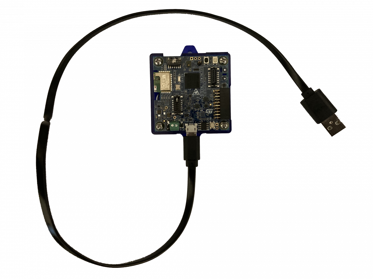
Starting with Qeexo AutoML 1.15.0, existing STWin users will have the option to migrate support from OpenOCD to DFU-Util to achieve flashing, data collection, and live testing through a single USB cable, omitting the STLink programming adapter.
To take advantage STWin single cable support:
Note: This process is only necessary for first time set up.
Connect one end of the micro-USB cable to your laptop first – DO NOT CONNECT the cable to STWINK1B yet
Locate and hold the USR button on the STWINK1B
While holding the USR button, connect STWINK1B to the other end of the micro-USB cable.
A red LED on STWINKT1B should blink when the device is connected to your laptop indicating the device is powered and in normal status. Your device is now ready to flash in Qeexo AutoML.
Dr. Geoffrey Newman, Dr. Leslie Schradin III, Tina Shyuan10 September 2021
Introduction
Qeexo AutoML provides feedback on trained models through tables and charts. These visualizations can be useful in determining how models trained in Qeexo AutoML should perform in live classification and can help form suggestions for how to improve model performance in specific circumstances, such as diagnosing why a certain class label is hard to classify correctly, or how to deal with an edge-case. In this blog post, we will explore which visualizations are available and how to interpret them.
We will look at two problems and machine learning solutions in this post: the first problem is very difficult to classify, and the results show that the machine learning solution only solves the problem partially. The second problem is easier, the machine learning solution performs better, though it is not perfect, and the results give indications for where and possibly how improvements can be made. Through exposure to both situations, the reader will be able to make better use of Qeexo AutoML to improve their understanding of their data and performance of their libraries.
Visualizations
The various visualizations provided by Qeexo AutoML will be explained here, in the same order as they are presented on the results page. This order was chosen for its practicality: it is the most common order (due to the progression of subtasks) used by machine learning engineers when working on a library.
UMAP
UMAP (Uniform Manifold Approximation and Projection) is a visualization technique documented on arxiv. UMAP provides a down-projection of the feature space into two dimensions to allow for visual inspections, giving information on the separability of instance labels. This is used as an indicator for how well a classifier could perform. Instances are colored based on the event labels, so it can be observed whether distinct labels may be separated based on the available features.
Figure 1: UMAP visualization
PCA
PCA (Principle Component Analysis) transforms the data into a new orthogonal basis, with the directions ordered by their explanation of the variation in the data. The two-dimensional PCA plots in Qeexo AutoML show the data projected onto the first two PCA directions. Similar to UMAP, these PCA plots give an indication of how separable the data may be when building machine learning models.
Figure 2: PCA visualization
Note: Both UMAP and PCA are projections from a higher-dimensional feature space onto two dimensions. Separability of the classes in the two-dimensional plots should imply separability in the higher-dimensional space. However, lack of separability of the classes in the two-dimensional plots does not always imply lack of separability in the higher-dimensional space: the structure of the data in the higher-dimensional space may be such that machine learning models can still separate the data and find good solutions to the problem.
Confusion Matrix
The confusion matrix shows machine learning evaluation results in a grid, giving a breakdown by class of how the evaluation examples have been classified. The rows of this grid correspond to the true label, while the columns correspond to the predicted label. Therefore the diagonal elements represent correct classifications while the off-diagonal elements represent mis-classifications.
The following measures, computed from the confusion matrix, are of use when understanding the ROC curves and F1-score plots in a later section:
True positive rate (sensitivity, recall): correctly-labeled positive instances divided by the total number of positive instances
True negative rate (specificity): correctly-labeled negative instances divided by the total number of negative instances
False positive rate: incorrectly-labeled negative instances (classified as positive) divided by the total number of negative instances
False negative rate: incorrectly-labeled positive instances (classified as negative) divided by the total number of positive instances
Precision: correctly-labeled positive instances divided by the total number of instances that have been classified as positive
It is important to keep in mind the trade-offs between these values when choosing how to balance a machine learning model. Depending on the task, it may be more important to have a high true positive rate, such as when it can be costly to miss a defective product, for example when performing quality control for automobile airbags. Increasing the true positive rate will have the trade-off of also increasing the false positive rate (or at least keep it constant) with all models. This can be an issue, for example, with a pacemaker. If it is constantly detecting a cardiac event and shocking the user, it could result in tissue damage or other problems if none had occurred (a false positive). Many of the visualizations in Qeexo AutoML derive from the need to balance these measures.
Figure 3: Confusion matrix
Cross-Validation: By-fold Accuracies vs. Classes
Qeexo AutoML performs 8-fold cross-validation when a new model is trained. The data is split into eight separate folds, seven of the folds are used to train the model, and the held-out 8th fold is used to evaluate performance. This process is repeated seven more times for each hold-out fold and the results are combined to determine performance. Training and evaluating via cross-validation allows one to get multiple draws from the training data set, so that the results across the folds are less likely to be accidentally biased in some way due to an unlucky split in the data. The values provided by multiple evaluation folds enables one to build up statistics (e.g. standard deviation) to get an estimate of the error of the evaluation result (e.g. mean value). All of the training data is utilized and treated equally; none of it is just used for training or evaluation.
The results of cross-validation are displayed as a bar graph. Bar heights indicate average by-class accuracy over all folds. Individual fold performance is shown as a scatter plot overlaying the bar for the specific label. The by-fold numerical accuracies are also displayed in a chart on the results page underneath the graph. Note that a given OVERALL accuracy number in the graph and table is the prediction accuracy based on all evaluations in the specific fold; it is not the average of the by-class accuracies within the fold.
Figure 4: Cross-validation plot and table
MCC
The Matthews correlation coefficient (MCC) is a performance measure for two-class classifiers. It takes the correlation between the predicted labels and the true labels after converting them to binary. For Qeexo AutoML we have extended the measure to work with an arbitrary number of classes; this is done by computing an MCC score for each pair of classes based on their confusion sub-matrix.
MCC has an advantage over raw accuracy in situations where the class labels are not well balanced. A good example of this is when Qeexo AutoML is attempting to determine classifier performance in an anomaly detection task where only a few examples of the bad class are available among hundreds or thousands of instances. Using the MCC measure in place of accuracy can give a more well-rounded view of the fitness of the classifier.
Here are some useful pieces of information about MCC:
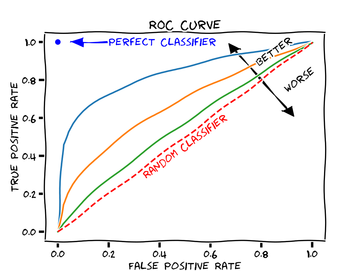
The ROC (Receiver Operating Characteristic) curve shows how different threshold values (applied to the continuous output of the classifier; e.g. class probability) affects the false positive rate (FPR) and true positive rate (TPR) of the classifier in cross-validation. As different thresholds are selected, the point on the graph with the FPR on the x-axis and TPR on the y-axis is found and plotted as a dot. These dots are then connected by line segments. Qeexo AutoML will generate these curves for each label and overlay them in different colors. This allows the user to determine how trade-offs in performance will have to be made with different thresholds.
The ROC curve can be used to generate summary statistics for describing the fitness of the model. A common one, which we compute with Qeexo AutoML and provide with the ROC curve plot, is the AUC (Area Under Curve). This is the integral of the ROC curve, and it has these properties:
Similar to the MCC, the F1-score is a performance measure, with larger values being better. It is in the range of 0 to 1, so the best value is 1. Similar to the ROC curve, we have chosen to plot the F1-scores against the False Positive Rate as we sweep through the threshold values. In the graph, the dotted vertical lines each indicates where the F1 score is maximized for a class.
Figure 8: F1-score visualization
Learning curve
The learning curve runs consecutive cross-validations with varying amounts of training data. The shape of the curve, and in particular the slope of the curve near the high limit of available training data, can be used to estimate whether additional training data could improve classifier performance. Given enough training data (drawn from the same underlying distribution), the learning curve will eventually asymptote to the best possible performance.
Figure 9: Learning curve
Discussion
The example plots above were from a Qeexo AutoML pipeline run with real data collected by Qeexo during the development of an embedded solution. In this case, each data set collected had a linked “testing data” for the specific “training data” label. As a result, two plots are generated for each type of analysis. The left (or center for single column figures) plots for each figure consist of training and evaluation of the model with cross-validation. When right-hand plots are shown, they are generated from evaluations on the “test” data (which is only used for evaluation, not for training).
Task Description
The task consisted of recording microphone data from stepper motors which rotate for 3 seconds, reverse direction, rotate for 3 seconds, and repeat. Some of the motors were determined by a factory quality assurance team to be defective for one of several reasons; those motors were labeled BAD, while the non-defective motors were labeled GOOD. The quality assurance team used sound to perform the classifications, but due to the subtlety of the difference in sound between the GOOD and BAD motors, this task is difficult for humans to perform. As we see from the results above, the machine learning model, trained on microphone sensor data, also struggles with this classification task.
Feature Exploration
This particular example had very hard-to-classify data. The UMAP and PCA plots are consistent with this. While there are some BAD examples that are mostly-separated from the GOOD examples (UMAP: x less than about 2; PCA: distance from origin greater than about 0.1), most of the BAD examples are intermingled with the GOOD examples in these projections.
UMAP and PCA plots such as these could be indicative of improperly-collected or mislabeled data, a lack of information in the sensor stream(s) used for separating the classes, or a feature set that is inadequate for extracting the information necessary for separation.
Performance Analysis
The confusion matrix and cross-validation results show that the model has learned at least something about the problem, but the performance estimates are not great (70 ± 10% overall). The model can correctly classify some of the GOOD training motors (80 ± 10%), but is not doing better than a coin-flip on the BAD training motors (50 ± 30%), although the results vary a lot by training fold. The performance of the model on the held-out test data is a bit better, about 90% on GOOD motors and 60% on the BAD ones; this seems to be consistent with the variation seen in the cross-validation results shown in the by-fold accuracies vs. classes plot and table (Figure 4).
While the classes have some degree of imbalance in this problem (82 good motors, 56 bad motors, with an equal amount of data collected from each), this imbalance is not extreme enough for the overall accuracy to be a useless metric, and it has an advantage over the MCC in one respect: we have intuition about accuracy, but most of us do not have intuition about MCC. Looking at the MCC scores (0.27 for the training data, 0.51 for the testing data), they seem in line with prior analysis: the model has learned something (MCC = 0 is equivalent to coin-flip), the model is far from perfect (MCC = 1 is perfect), and the model performance on the test data is better than on the training data.
The ROC and F1-score curves are generally useful for understanding a model’s performance across a wide range of thresholds, and possibly fine-tuning the threshold to balance the model to the desired trade-off between the classes. The model performance curves for the training evaluations are not encouraging in the case at hand: there does not seem to be a threshold that can improve the overall model performance from the default threshold value used to produce the cross-validation results. The test curve, on the other hand, shows a bit more promise. In the test ROC curve, one can see that by choosing a lower threshold, it is possible to get into the upper–70s in terms of accuracy for both classes simultaneously (True Positive Rate ~ 0.78, False Positive Rate ~ 0.22 -> True Negative Rate ~ 0.78). This is a little better than the overall test accuracy value (76%) computable from the confusion matrix. The ROC and F1-score curves are usually more useful when the model is close to the desired performance.
The learning curve gives an estimate for whether adding more training data will likely result in increased performance for the model under consideration. Unfortunately, in the learning curve plot for the problem at hand, while there is a slight increase in performance on the BAD data from 25k to about 45k training examples, over the same range the performance on the GOOD data is constant or decreasing slightly. The curves as a whole appear to be pretty flat, indicating that more training data of the same type is unlikely to significantly improve performance for the model in question.
Note that in general, learning curve results hold for the given model and hyperparameters set under consideration. It could be that the model is just not complex enough to learn the problem (meaning it has high bias error), and that a more-complex model could do better. There could be a benefit from adding more data (that is, the learning curve when considering a more-complex model and hyperparameters set could have positive slope near the end of the graph). It is also possible that the performance just will not increase beyond the upper bound seen in these results regardless of more data.
Overall, the results show that while the model has learned from the data, it has not learned enough to approach Qeexo’s original goal for this problem: to achieve by-class accuracies greater than 90% on this task. The gap is great enough between actual and desired performance that it indicates some basic change will be needed to improve the situation:
verify that the data sources have been labeled correctly
use different sensor streams that can capture better separability information
use different features for the same reason (for feature-based models)
perform more exploratory data analysis and data visualization to better understand the core problem
Alternative Task
The previous figures were generated with a problem and data that is difficult to classify. We also want to give the audience an example problem and data where a model performs better.
Task Description
This task is described as an “air gesture classification”. It consists of using accelerometer and gyroscope on an embedded device which is affixed to a stick used to perform motion gestures. These gestures include raising and lowering the stick, labeled DRUMS, and rocking the stick back and forth, labeled VIOLIN. The BASELINE label consists of not moving the stick, and is the appropriate output for when the user is not moving the stick in either the DRUMS or VIOLIN gesture.
Task Results
The UMAP visualization for this task shows very good separation between DRUMS and the other classes. There is overlap between VIOLIN and BASELINE, although there appears to be a large area of BASELINE outside of this region of overlap.
Figure 10: UMAP – air gesture
The PCA plot gives similar information: DRUMS appears to be quite different from the other two classes in this projection, while VIOLIN and BASELINE appear similar to each other. The fact that DRUMS appears separable seems reasonable: playing drums requires broad sweeping motions that should create large-magnitude swings in the inertial sensors.
These plots indicate that DRUMS should likely be separable from the other two classes. VIOLIN and BASELINE may also be separable by a machine learning model, but there is no good indication of that in these two-dimensional projections.
Figure 11: PCA – air gesture
The confusion matrix shows OK classification. Most of the values are along the diagonal with by-class accuracies of 74% for BASELINE, 97% for DRUMS, and 77% for VIOLIN. The two most commonly-confused classes are BASELINE and VIOLIN, with each being classified as the other about 20% of the time. This result is not surprising given the aforementioned visualizations, but given the nature of the problem, we should expect better: these two gestures are different-enough to be obviously recognized as different by humans performing or observing them, and the differences should be obvious in the sensor streams chosen (accelerometer and gyroscope).
It is surprising that a significant fraction of the BASELINE data (~9%) has been mis-classified as DRUM. These two classes were well-separated in the UMAP and PCA plots, and given the differences in these gestures we might expect these two classes to be the easiest to separate. In addition, the mis-classification is not symmetric: only about ~2% of the DRUM examples are mis-classified as BASELINE.
Figure 12: Confusion matrix – air gesture
The by-fold cross-validation results give valuable information that is not captured by the overall confusion matrix: the model performance varies a lot by fold. Half of the folds show good-to-excellent performance with 95% or greater overall accuracy with reasonable by-class accuracies. This indicates that for these folds, training is probably proceeding well, and that the problem in general is likely solvable by the model in question. The other folds show serious problems: each fold has at least one class with by-class accuracy less than 50%. This indicates that there is some problem with the model, although it’s not clear what the problem might be. We’ll discuss in a later section about what might be going wrong.
Figure 13: Cross-validation – air gesture
The MCC results support what we have seen so far in the confusion matrix and cross-validation results: the problem is solved to some extent, but there is likely an issue with the performance with the BASELINE class. The DRUMS-VIOLIN score is quite good (meaning the model separates these classes well), but the scores involving BASELINE are less promising.
Figure 14: MCC – air gesture
The ROC curves from this model are clearly better than those from the previous example problem, with larger AUC values (all > 0.9). These curves, as well as the F1-score curves, also show that the BASELINE class has lower performance than the other gesture classes.
Figure 15: ROC plot – air gestureFigure 16: F1-score – air gesture
The learning curve for this model shows that as we increase the amount of data, we are improving the BASELINE classification without decreasing performance for DRUMS or VIOLIN. Based on the confusion we see with the current model, combined with the appearance of the curve not approaching an asymptote (probably), it is reasonable to expect that collecting more data and retraining the model would increase the BASELINE separability.
Figure 17: Learning curve – air gesture
Performance Analysis
Several pieces of information point to poor performance of the BASELINE class, and the by-fold cross-validation results show that there is some sort of problem for half of the training/validation fold pairs. The learning curve result indicates that more data could increase performance of the BASELINE class.
Ideas about possible root causes of the problem seen in the by-fold cross-validation results along with possible actions follow:
The training data may not be diverse enough. Specifically in this case, the BASELINE data may not be diverse enough. We at Qeexo have observed this difficulty often in problems in which there is a “baseline” or “background” kind of class. If the BASELINE data collections were performed with the stick held very still, or with just a few grips on the stick, large sections of the BASELINE data could be very similar to each other while also being quite different (from the standpoint of say statistical features like mean and variance of the signal) from other large sections of the BASELINE data. For example, each section might be comprised basically of 0-vector data for the gyroscope, and constant-vector data for the accelerometer, but different and distinct constant accelerometer vectors for each section. Another way to look at it is that the BASELINE data might look like several discrete scenarios that do not connect to each other very well in feature space. This situation can cause machine learning models difficulties in training. Note though that the UMAP and PCA plots do not directly support this hypothesis: the BASELINE data appears mostly clumped together in those plots. On the other hand, there are BASELINE outliers in the PCA plot, and the UMAP plot has a relatively-large area for the BASELINE data. With more rich BASELINE data, it is possible that the machine learning models will learn to generalize better to other BASELINE scenarios not in the training data.
There may not be enough training data. By its nature, cross-validation trains on part of the training data and evaluates on the held-out validation set. If some particular scenario (e.g. the user holds the stick with a certain grip) only appears for a short time in the training data, when the data associated with that scenario is mostly or entirely contained within a validation fold, the training fold will contain little or no data associated with the scenario, and the model may not learn and perform well on that scenario. Collecting more training data of the same kind that has already been collected should help in this case. This is supported by the shape of the learning curves. Also notable: more training data is likely to help for the last two points described in this bullet list: if there is overfitting or lack of convergence.
There may be a problem with some of the data. If it has not been done already, the data should be visualized to make sure that there are no corrupted parts. Visual inspection of the data should also show human-readable separability for this problem, given the nature of the air gesture use case. If it does not, there is likely something wrong somewhere in the data collection process.
The machine learning model may sometimes be overfitting to the training data; that is, it may be learning not only the underlying problem that we want to solve, but also the noise that exists in the training data as well. If so, changing the model hyperparameters in a way to make the model less complex or to increase regularization may help reduce the model variability and improve performance.
Depending on the model type used, the model may have failed to converge for some of the folds. We at Qeexo have observed this most often for some neural network models. This may be considered a sort-of sub-case of the previous point. Changing the hyperparameters may improve performance in this case as well. For example, increasing the number of epochs while also reducing the learning rate may help.
We think the first two points above are most likely the best explanations of the problems seen in the evaluations, and contain the best ideas for fixing the problems: collect more training data, and in particular collect more BASELINE data in a way that gives more diversity for the data for that class.
A variation of this use case after improvements had been recorded into a demo.
Conclusion
Qeexo AutoML not only provides model-building functionality, but also presents visualizations of the data and evaluation metrics for the trained models. By understanding these various visualizations and metrics, one can gain insights into the problem the model is attempting to solve, as well as how the model is performing on the collected data and how it might be expected to perform when deployed to the device. (Deployment to device can be done with just one click on Qeexo AutoML.) Such insights can lead to useful actions that can significantly improve the performance of the machine learning model.
The dream of every developer is to be able to write code once and deploy everywhere. This allows for smaller teams to deploy more reliable products to a wider variety of users. Unfortunately, due to the numerous different operating systems with varying underlying kernels and user interface APIs, this often turns into a nightmare for developers.
Why interpreted languages are insufficient
Interpreted languages like Python in theory are great for cross platform code deployment. There are interpreters available for nearly any platform in existence. However, in a number of crucial ways, they fall short. First is the relative difficulty in protecting intellectual property. Because the code is not compiled, it is viewable to anyone in plain text. This requires techniques such as obfuscation or Cython compilation, both of which make debugging and deployment very complicated. Even semi-compiled languages such as Java can suffer from this problem.
Another major issue with shipping interpreted code to end users is the installation size. Shipping the python interpreter, pip, a number of pip packages, and the code can easily exceed a gigabyte on disk for even a simple application. Electron suffers from similar issues, having to bundle an entire Chromium install. This often results in subpar apps that love to consume memory.
Finally, dependency management on end users’ machines tends to be very unreliable with Python. If the code a developer is shipping relies on a specific package version (for example, Tensorflow 2.4.2), an install script attempting to install that package may encounter a version conflict. The script at this point must make the decision to abort or overwrite the user’s existing package. Both of these result in an extremely poor user experience. Packaging tools such as pipenv attempt to solve this, but this assumes that the user has the tool installed and that the version the user has installed matches that of the install script. Another way to solve this is to create an entirely separate Python install on the user’s machine, but this takes up unnecessary space and is still not immune to reliability issues and version conflicts. Additionally, the requirement of an internet connection is a concern for customers whose internet access may be limited or restricted for security reasons.
Compiled language candidates
Compiled languages are an alternative to interpreted languages that are able to fulfil the requirements of intellectual property protection, small installation size, dependency management, and reliability. Below we consider a few:
C/C++ Pros
Mature compilers available for every OS
Decades of well documented and tested libraries that are multiplatform
Well understood by developers everywhere
Cons
No support for modern language features such as copy-on-write, optionals, built-in JSON parsing, etc.
Weakly typed with no null protections
Inconsistent standard library between Unix-based and Windows-based platforms without additional dependencies
No standard package manager
GO Pros
Fast compiles
Relatively simple syntax
Statically typed
Cons
Garbage-collection-based memory management can lead to performance issues
No generics
Omits some features from more complex languages that help to reduce boilerplate code
Somewhat of a niche language that reduces overall usability due to the lack of available open source packages and community help
Rust Pros
Modern language with strict typing, generics, patterns, etc.
“Automatic” memory management at compile time
Large community support
Cons
No stable ABI, with no plans to adopt one
Steep learning curve
Somewhat complex C bindings, with native Rust libraries unable to bridge the gap
Choosing Swift
Swift was originally developed to run on Apple platforms only. In 2016, Linux support was added. Since then, a large number of Swift packages have been designed to be compatible with both operating systems. In 2020, Windows support was added, completing support for the trio of major operating systems. For Qeexo, Swift ticked all the boxes. It is a modern language with features like type safety, optionals, generics, and a useful standard library, while also being cross platform, reliable, producing relatively small binaries, and protecting intellectual property. Additionally, with easy bindings into C code, it is easy to write code that interacts with well-tested, cross-platform libraries such as libusb.
Moving from Qeexo’s existing Python-based desktop client to one written purely in Swift has taken the installer size down from 108MB to 18MB, the install time from 57 seconds to 13 seconds, and from 830MB on disk to 58MB on disk. Additionally, the reliability of the installer and first-launch experience has improved substantially, with no dependency issues occurring because of lack of internet, version conflicts, and bad Python installs.
Write Swift once, run it everywhere
Thanks to a robust standard library, many of the operations required for our application such as network requests, JSON serialization, error handling, etc., simply work no matter which platform the code is running on. However, for complex tasks like USB device communication or WebSocket servers, more complex techniques were required. Libraries such as SwiftSerial or Vapor exist but are only supported on macOS and Linux due to the relatively new support of Swift on Windows. Rather than attempting to create a reliable WebSocket server or USB interface code from scratch on Windows in Swift, it was easier to hook into C libraries such as libwebsocket and libusb. Using a simple Swift package and module map (for example: https://github.com/NobodyNada/Clibwebsockets), Swift is easily able to pick up statically-linked libraries or dynamically-linked libraries (.dylib on Mac, .so on Linux, and .dll on Windows), and provide them with Swift syntax after a simple module import. These libraries are already cross-platform, so the work is already done. It only requires integrating a build script for the library into the overall compile process. Using these techniques, very few locations required #if os() checks in our code. These included paths for log locations, paths for compiler flags in the package file, and USB path discovery. Everything else works the same across all operating systems.
Challenges with cross-platform Swift
As of the time this blog was published, Swift has only been available on Windows for less than a year. This means that resources such as Stackoverflow questions and libraries designed for Swift on Windows are sparse. Everything has to be built from scratch, discovered in the documentation, integrated from a C library, or discovered by looking at the Swift language source code. This will improve over time, but for the moment, cross-platform Swift programming can be a bit daunting for new users. For example, Alamofire, a very popular networking library for Swift, did not support Windows nor Linux until very recently. Qeexo contributed patches to the open-source library to get it into a working state.
Another issue is that Swift is not considered ABI-stable on Windows nor Linux yet. This means that all apps have to bundle the Swift runtime, rather than being able to take advantage of shared libraries. The library is not overly bloated, so this is not a major concern, but it is still a consideration.
Finally, even though Swift does run cross-platform, often times special considerations have to be made. For example, the function sleep() is not part of the Swift standard library. It comes from POSIX. This means that code using the function will not compile on Windows. Instead, helper functions using Grand Central Dispatch and semaphores had to be developed to simulate a sleep function. In addition, UI libraries are not standardized. macOS uses Cocoa, Windows uses WinUI/WPF, and Linux uses Xlib. Swift is capable of interacting with all 3 APIs, but all code will require #if os() checks and the code will be different per OS. As a result, Qeexo chose to write small wrapper apps in the OS’s preferred language in Swift/C#, then spawn the cross-platform Swift core as a secondary process. An added benefit is that the helper app is able to watch the subprocess for crashes and alert the user in a seamless fashion.
A Swift Future
Thanks to an active community, a group dedicated to Swift on the server, and the backing of one of the largest technology companies on the planet (Apple), cross-platform Swift has a bright future. Eventually, SwiftUI might even allow for truly cross-platform UI development. In the meantime, Swift has allowed Qeexo to deploy a reliable and compact app that protects intellectual property and is truly cross-platform.